






















After ten years, the DFB-Pokal is being rethought: new logos, a new colour world and a look that adapts to wherever it's experienced. The DFB explains why.
The DFB-Pokal enters the 2026/27 season with a new visual identity, its first redesign in ten years. Together with agency Strichpunkt, the German Football Association (DFB) has reworked the entire brand presence, from the logos to the colour world to the tone of its communication. The stated goal: to finally make the competition's presentation feel as unpredictable as the competition itself.
That's exactly where the strikingly self-critical reasoning comes in. "The DFB-Pokal was never predictable. Our brand recently was," says Holger Merk, head of brand at the DFB. "Going forward, we're showing the DFB-Pokal as it really is: loud, emotional and surprising."
New Logos for the DFB-Pokal: All Three Trophies Get Their Own Mark
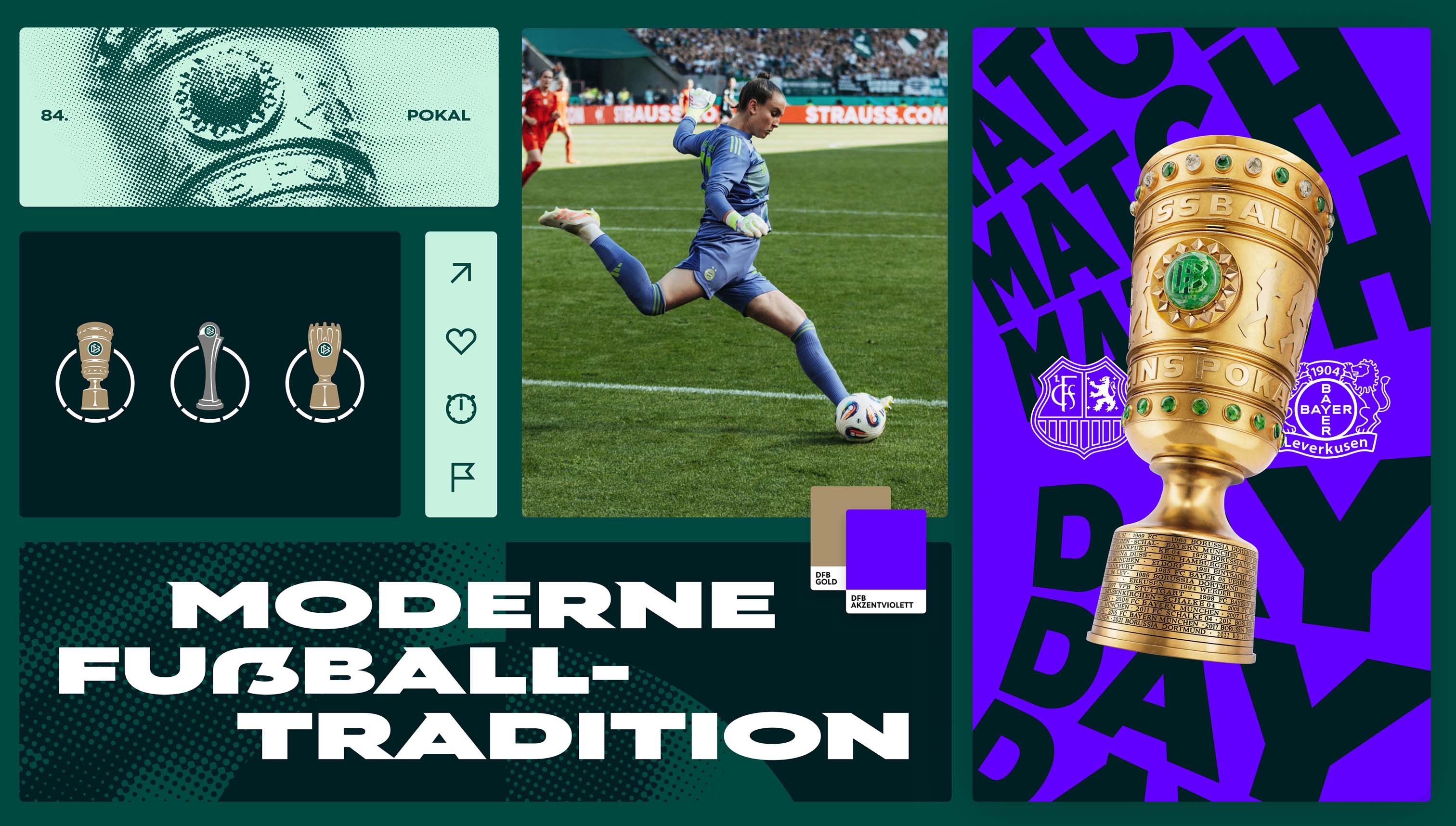
The most visible element of the new identity is the logos: the women's, men's and youth cup competitions each receive their own standalone marks, realistically depicting the respective trophy. Each competition gets its own face, while a shared design language keeps them connected.
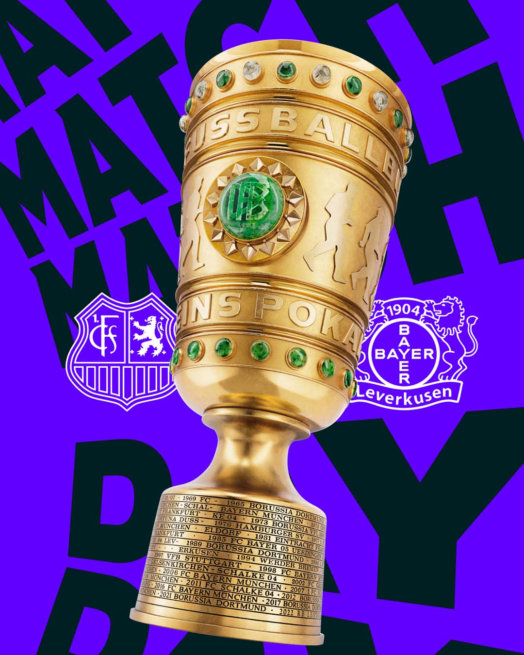
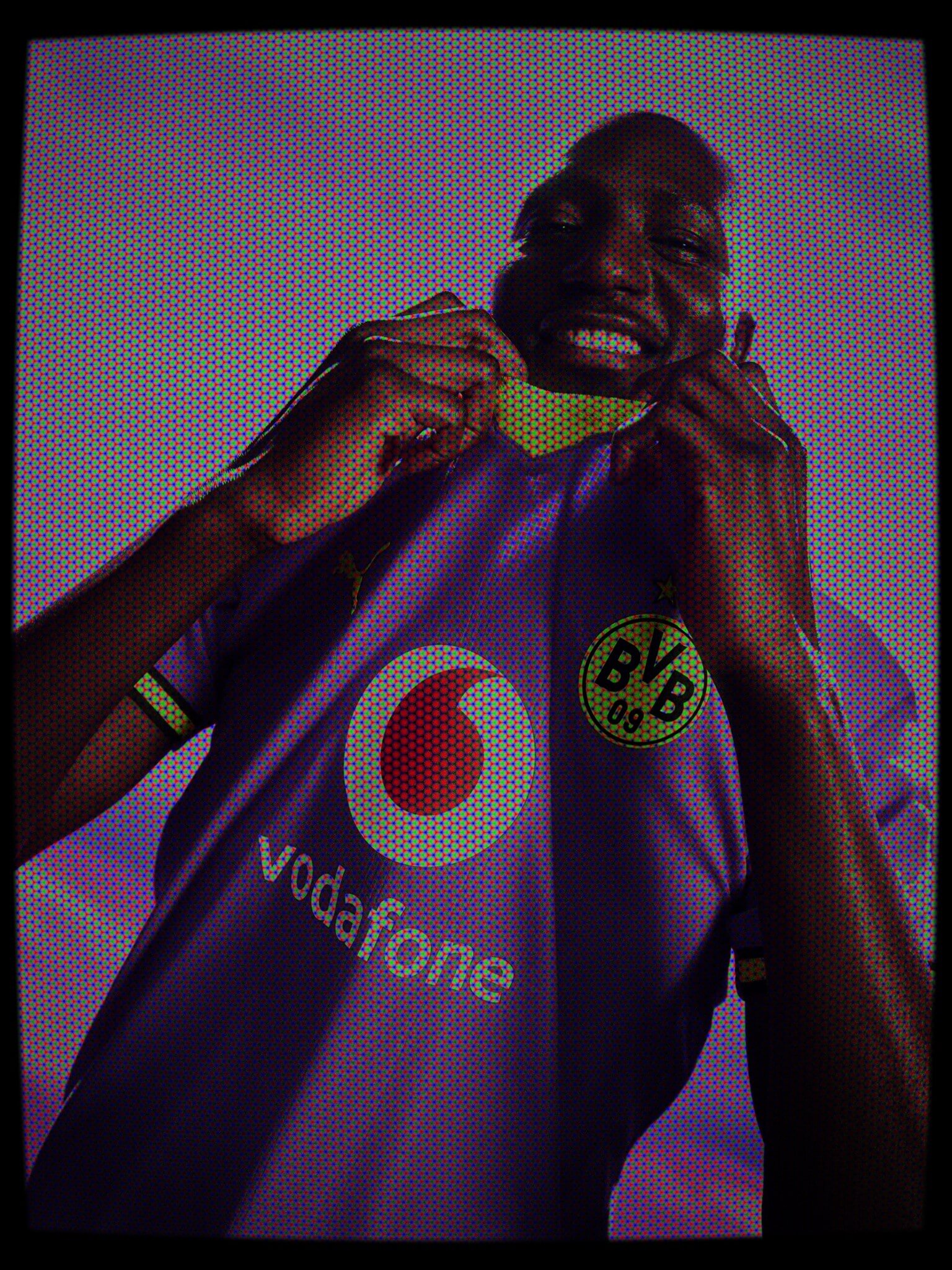
The logic behind it is worth noting: the new look adapts to the context it appears in. Inside the stadium, the DFB-Pokal keeps its familiar green, where the game itself stays at the centre, along with the fans who've stood on the terraces for years. On social media, meanwhile, the federation is introducing purple as a contrast colour, where goals, tackles and duels from the cup's heroes are meant to be staged louder and more expressively. For the digital audience, as the DFB itself puts it, things are set to get "rougher, faster, wilder."
Fittingly, the DFB-Pokal's rebrand is part of a wider trend: Bundesliga club Werder Bremen and the French Football Federation also recently unveiled new visual identities of their own.
Why the DFB-Pokal Wants to Get Younger
Behind the overhaul lies a clear audience strategy: the competition is meant to have a stronger presence in the digital world of younger fans, with a more direct tone and more stories from the stadium and the dressing room. To that end, the DFB will now work with cultural marketing agency MANERA.
The material for that is something the cup delivers every year on its own: it's the only national competition connecting professional and amateur football, every tie is a straight knockout, and it's the underdogs who, among others, write the biggest stories year after year. Whether the new design lives up to the competition's promise will show from the first round of the new season onward.

