


























A new typeface, sharpened green, colour tones with Bremen names: Werder Bremen get a new corporate design, developed with studio Societas, which previously reworked the visual identity of VfB Stuttgart.
Werder Bremen have unveiled a new corporate design, developed together with Munich-based design studio Societas. It will be rolled out gradually from the 2026/27 season, over a period of two to three years, until then every touchpoint of the club will be transitioned to the new look, from the Weserstadion to digital channels to merchandise.
The ambition behind it: not a fresh start, but a more precise appearance. The club's identity hasn't been redefined, it's meant to become clearer and more consistent, guided by the club's brand values: beherzt (bold), menschlich (human), bodenständig (down-to-earth) and plietsch (sharp-witted).
Diamond stays, green gets sharper: Werder's new visual identity in detail
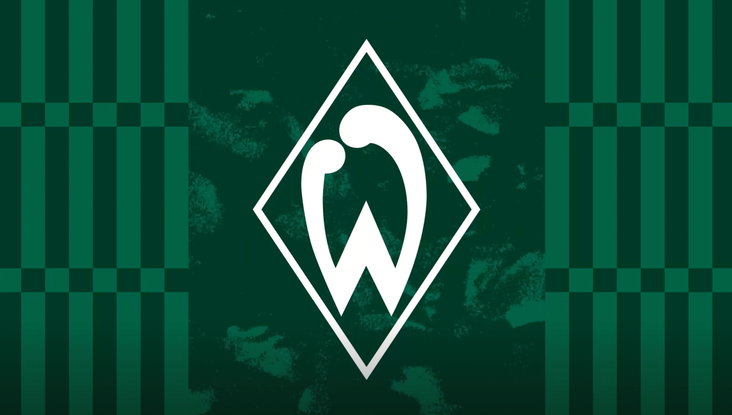
The most important element remains untouched: the Werder diamond was both the starting point and the benchmark for the entire project. The Werder Green has been sharpened, richer, calmer, more Hanseatic.
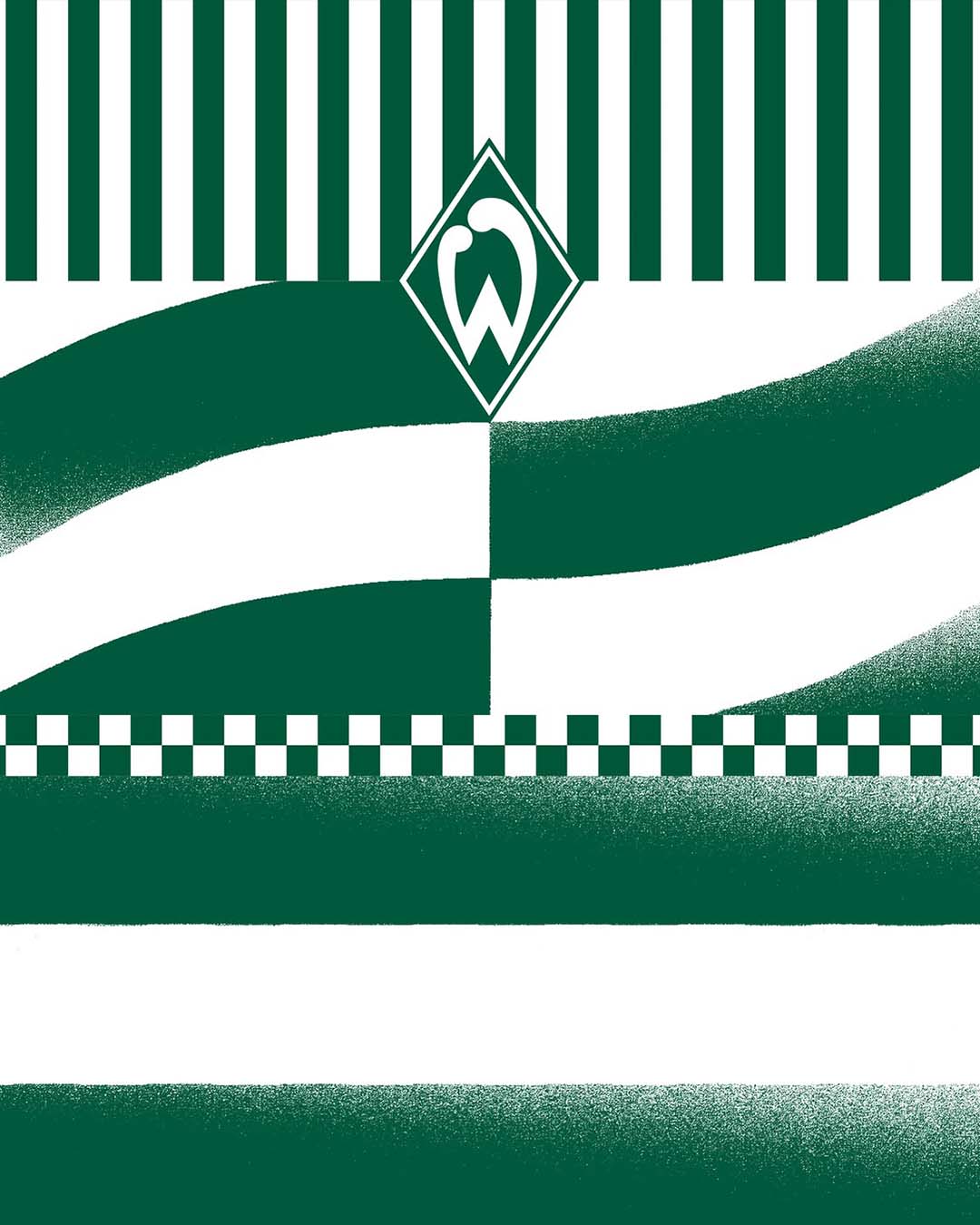
Alongside it comes an expanded colour palette, its tones all carrying Bremen-rooted names: Werder White, Werderkern Green, Wesernebel Grey, Weserlicht Green for digital applications, and Legenden Gold, reserved for the moments and people that have shaped the club's history. Bespoke patterns also reference the Speckflagge, Bremen's red-and-white striped flag.
One standout detail is the new typeface, Bruckmeyer Neue. It was developed exclusively for the club and is named after Günther Bruckmeyer, the graphic designer who created the first Werder 'W' in 1924, the design origin of today's diamond. Around a hundred years later, the serif typeface, whose forms are inspired by the geometry of the W, carries his name.
Not a pitch, but a dialogue: how Werder Bremen and Societas worked together
The path to the result is notable too. After a selection process involving six agencies, Werder deliberately chose not to run a classic creative pitch, opting instead for a collaborative development process with Societas.
„Werder is a club with an exceptionally clear identity. Our task wasn't to redefine that identity, but to give it a visual form that does it justice. This wasn't a project about design. It was a project about attitude," says Mirko Borsche, co-founder and creative director of the studio.
In German football, Societas is no stranger anymore: the studio has designed collections for FC Augsburg and VfL Bochum, becomes kit supplier for TSV 1860 München this season, and previously reworked the visual identity of VfB Stuttgart. Werder is now the second Bundesliga club whose visual identity the studio has shaped.